
Capturing the Spirit of Slim’s
Bringing the mood of a familiar Raleigh dive bar into a website that's easier to find your way around and keep up to date.
I’d been to Slim’s a number of times before I ever looked at its website. I knew the dim lighting, the neon, the punky, retro feel of the place. It’s a proper dive bar and music venue, and there was a lot to work with from a design perspective.
When I decided to get back into web work, the field I’d spent most of my adult life pursuing, I started looking at familiar local businesses that might need some help. Slim’s caught my attention pretty quickly. The navigation was cluttered, the bar menu was an image, and there wasn’t much consistency between pages. Parts of the site were on different domains, with the calendar on slimsraleigh.com and the main site on slimsdivebar.com. It was clunky to navigate, and the design didn’t give you much of a feel for the bar.
After a bit of research, I learned that new owners had bought and revived Slim’s following a closure. I reached out to ask whether they’d be interested in a redesign and offered to put together a mockup. I sent it over, and we got on the phone a few days later.
Bringing the bar into the design
I used photographs from their existing site for the mockup. Having spent time at Slim’s made the colors fairly easy to choose. I wanted to bring some of that dim, neon-lit atmosphere onto the screen, with colors that worked well against each other and felt at home with the photos.
For the type, I went with chunky lettering and script-style fonts that fit the feel of the logo. The body font needed to be bold and easy to read. People still had to be able to find a show, read the menu, or get in touch without struggling with the design.
Each page got a different background photograph so moving through the site would feel a little like moving through the bar:
- The menu uses a photo of the bar itself.
- Music & Events shows the space leading up to the stage.
- The homepage uses the chalkboard, with years of writing, history, and character.
The chalkboard was a particularly good fit for the homepage. It gives you a sense of the community at a glance, and brings some of the bar’s musical history and spirit of celebration into the page. I wanted each image to have a purpose, and each page to feel like it belonged to the same place.
Making it easy to use and look after
The response to the mockup was that it was very much the direction they were looking for. The phone call gave me a better idea of what they needed beyond the design.
A big part of it was the working relationship. They wanted someone who was easy to communicate with and would care about the content being posted. I like working with local businesses and getting to know the people behind them, so that was a good fit.
The site needed to be fairly hands-off for the owners. It should tell visitors what they wanted to know without much searching, give them a reliable way to get in touch, and have an event calendar that wasn’t a headache to manage.
I brought the calendar into the main site, made the menu readable, and organized the navigation so the different parts of the site worked together. Contact and booking information became easier to find, and the pages needed to be comfortable to use on a phone too.
Keeping the calendar moving
Music & Events gives Slim’s a place to promote its artists and let people know what’s coming up. It brings an important part of the bar into the main site, where visitors can find it easily.
Since the redesign, I’ve continued supporting the calendar and developed a custom WordPress plugin for Slim’s. The aim is to keep the site current and easy to look after, so the owners can focus on the bar. That ongoing work has become a substantial part of the project.
The part I’m proudest of
The event plugin is where I’ve put the most development time, but the overall design is still what I’m proudest of. Especially on the homepage, I like how the colors bounce off each other, how the shapes fit together, and how the photographs set the mood.
The site feels much more put together than it did when I first came across it. You can move from the homepage to the menu or an upcoming show and still feel like you’re in the same place. It brings the spirit of Slim’s together online, and that feeling is what I most wanted to get right.
Before and after
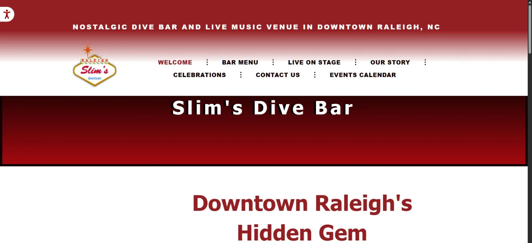
Before: the archived homepage, with its competing navigation and crowded header.
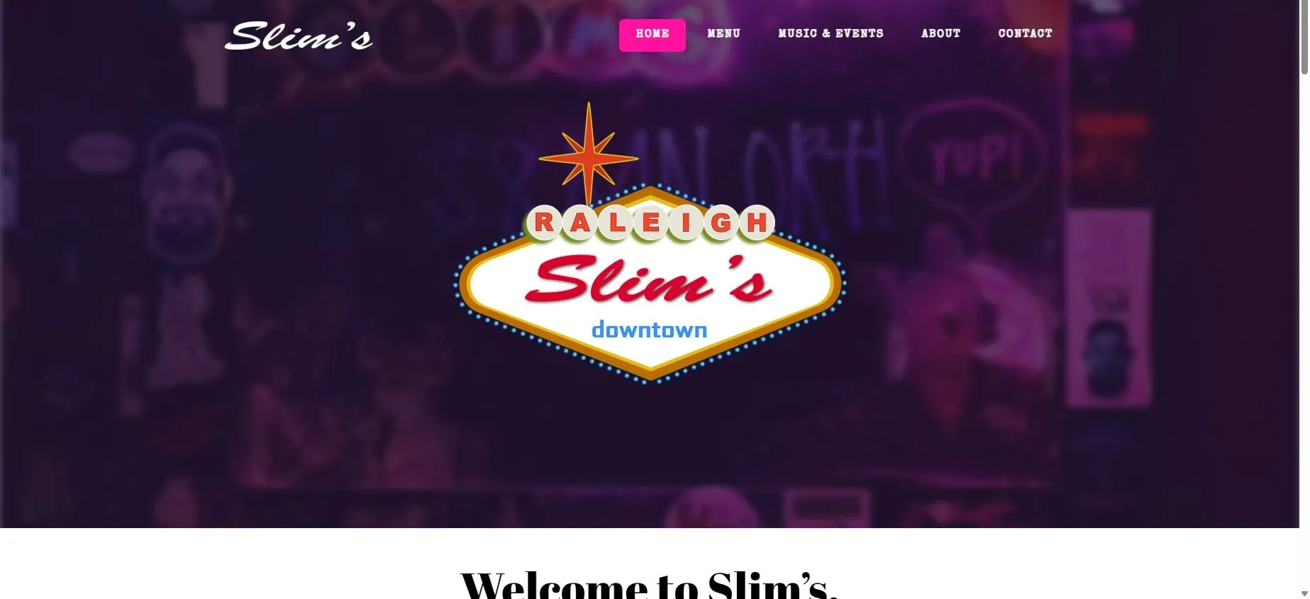
After: the bar’s own sign and atmosphere lead the page.